Visualizing the Complex
Redesigning a complex information visualization for ease of understanding
Personas, Information Architecture, Wireframes, Agile/Lean UX
The Challenge
Product Managers and Executives need to digest data quickly to improve their manufacturing process and prevent safety issues globally.
This particular visualization is meant to help identify issues that have more severe consequences and eradicate them quickly.
However,
Relevant data was hard to find, compare, and organize into patterns.
Users were unable to make informed decisions, and felt frustrated
With a fixed launch date and limited resources, the redesign needed to be done in less than a week
My Role
Research users, tasks, and workflows and produce actionable deliverables (personas, workflow diagrams, etc)
Apply best practices of information architecture and data visualization
Interaction design for redesigned workflows
Usability testing and iteration
Implementation in an agile environment and prototyping (Tableau)
Let Image: The original design focused on comparing data across all the divisions, and the result is far too much information to parse
Right Image: The redesign instead focuses on comparing the metrics within a division, providing more focused and actionable data.
The Process
Learning about the users
When I joined the project, there was no clear understanding of what the users needed and assumptions were never clarified. As a result, there was no clear understanding on what the key issues were, and no plan of action on how and which issues we needed to address. I therefore began this project with an effort to understand the attitudes, needs, and workflows of the users (Product Managers and Executive), to clarify scope and formulate a plan of action.
Image Caption: One of the personas I created based on my user research
Identifying the Key Issues
Over the course of several interviews and working sessions with the users, I was able to make several key insights on how to approach the redesign:
Issues with information architecture were placing the original visualizations at inconsistent hierarchy levels, and this had a large impact on findability of data. The visualizations were exceedingly different to parse, understand at a glance, and key information such as date range was being consistently missed by readers.
Comparisons across divisions were unnecessary, this was a feature of the current visualization that wasn’t needed and was only making the design more confusing
The old visuals aggregated the totals (incorrectly) which didn’t match the user’s need. A metaphor would be that the users needed to see a report card (to see how they fared on each subject), instead they saw a frequency distribution of their grades (how many a’s and b’s they got). (see image below)
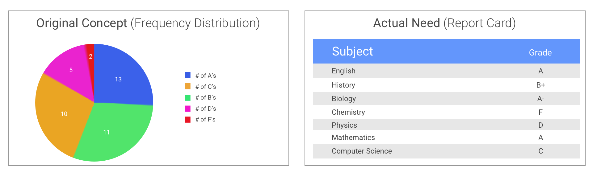
Using a metaphor to demonstrate the issue
Left Image: The original design incorrectly assumed that the users needed to see a frequency distribution. i.e. how many A's did you get
Right Image: The users instead needed to see their grades for each subject and decided which one to spend more focus on.
Prioritizing Issues
With only a week of sprint time to do principle design, I focused on finding easily-to-implement solutions that would have the highest impact on the pain points I found in my research.
I found that the best way to create the most value with the limited time and resources was to focus on improving the information architecture of the visuals and applying the principles of data visualization from thinkers such as Tufte.
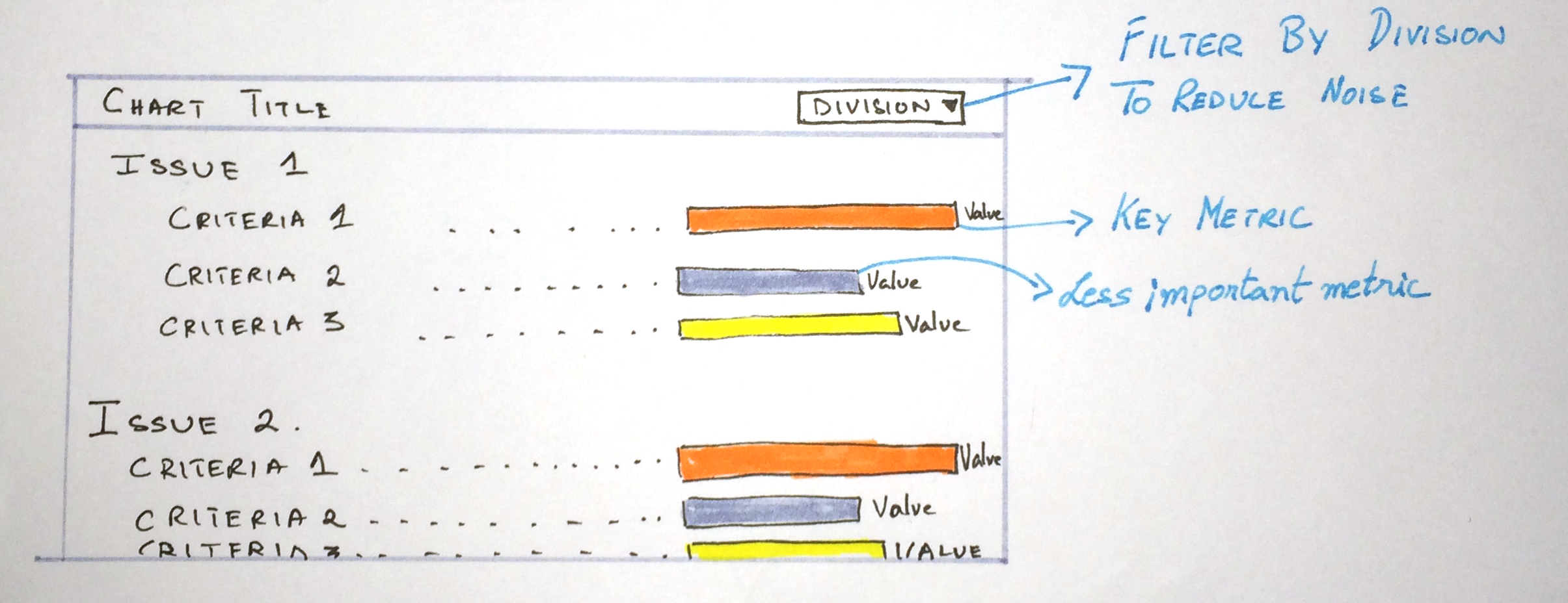
Key Metrics
From my research, I discovered that the users were having a hard time identifying the key metrics. As a result my first priority was to rearrange the data so that the key information stood out. This would help the users immediately know what is going on.
Information Architecture
The users were finding it difficult to situate themselves with the relevant contextual information. Some of the most critical information (Title, dates, key) were obscured because of poor information architecture.
I repositioned titles, dates, and filters to make them more predominant and findable. I applied industry best practices that made the data much easier to read at a glance.
Reducing Noise
Finally,I focused on the filter interaction to make it more closely resemble the user’s mental model, reducing the number of filters on the screen to prevent information overload, and adding a “Division” filter that allowed the users a key way to prevent comparisons they they had no reason for.
Testing and Iteration
In order to verify that the new design would make the intended impact on the pain points I identified, I subjected it to several usability tests with the original user group. Because this was prior to development, low-fidelity wireframes were used, and the tests were focused on monitoring findability times, as well as user’s response to the designs and their practicality for use in their workflows.
The tests showed findability was greatly increased, with users able to locate information when asked much faster compared to the previous design. However, a new issue was found during testing. The original goal of the visualization was to “report how each issue had done overall”. But this was not enough, the users were ultimately trying to make a decision with regards to which issue needed more attention. Thus, I re-designed the visualization to allow for easy comparison. This greatly improved their overall findability, and helped them with their
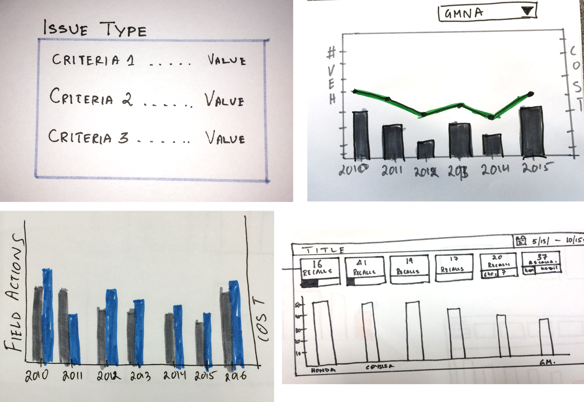


Click to enlarge
Image 1: A collection of early concpets I tried to figure out what would work
Images 2 and 3 : Using sketches to refine the concept based on user feedback.
Image 4: Creating a quick mockup to usability test the concept more throughly.
Image 5: Implementing the updated design and launching it globally to get more feedback from the users.
Image 6: Final design based on user feedback
Implementation
This project was scheduled for a very quick turnaround for implementation, and issues had to be dealt with quickly. Because the underlying technology (Tableau for visualizations, and Cognos for layouts) had limited capabilities, I was often called upon to do quick prototypes to aid the development team in finding ways to implement my designs.
Through the course of this prototyping at times changes had to be made “on the fly” to make the design fit the constraints imposed by the technology, but in the end through my involvement in the implementation process I was able to make sure the final result retained those elements of the design that addressed the key pain point insights I had uncovered.
Image Caption: The redesign removes unnecessary noise and focuses on showing the data clearly